StudyBee - A Case study
Running a startup is a crazy ride. Frequent ups and downs but still in some regard very rewarding because you learn a lot of things and you have the complete responsibility. In 2015 a friend of mine asked me If I would be interested in joining StudyBee, a newly started company, with the ambition of making the life better for schools and teachers when it comes to grading. The company was possible because of the support from the Sony Mobile Startup Program where three of the team members (from Sony) had the possibility to join due to cut-downs.
In this case study I will mainly focus on the bigger picture with some detailed examples on how we solved certain obstacles. I will talk about how we approached the project from the beginning and how it evolved.
In this case study I will mainly focus on the bigger picture with some detailed examples on how we solved certain obstacles. I will talk about how we approached the project from the beginning and how it evolved.
My role
I was the lead designer in StudyBee from 2015 to 2020. I have since the beginning been involved in all aspects of our tools including chrome extension for Google Classroom, mobile app for students plus other tools and features that is yet to come. I had the responsibility of:
• User research
• Experience strategy and vision
• Planning and scope definition
• Design execution and validation
• Product management
• Leadership
• Experience strategy and vision
• Planning and scope definition
• Design execution and validation
• Product management
• Leadership
About running a start-up as a UX designer
There are two things to keep in mind in a startup and that is finite resources and time. These have a huge impact on every decision in the company. Everybody in the team must constantly make difficult prioritizations and be pragmatic.
Being a UX designer in a start-up is challenging. Some work methods tend to be compromised and you cannot expect that you will be able to fully make use of all your design skills. For a designer, in this early stage, it is more like laying the foundation to continue iterate the product in the right direction.
Being a UX designer in a start-up is challenging. Some work methods tend to be compromised and you cannot expect that you will be able to fully make use of all your design skills. For a designer, in this early stage, it is more like laying the foundation to continue iterate the product in the right direction.
The challenge of entering an unknown market and survive
The ambition was high. We knew very little about the ed-tech business and we did not know that much about the users (schools, teachers, students) either. Fortunately, one in the team had previously worked as a teacher for ten years.
In Sweden, at that time, there was a discussion that the performance in schools was not going well. There was a frustration among schools and teachers that there was too much administration and not enough time for teaching. Furthermore, the teachers’ salaries have not kept up with other professions. Student performance had also declined according to different studies. Beside this we had also heard that the learning management systems (LMS) that the schools were using were too big and complex and the teachers hated most of them. So, we figured that there might be an opportunity here to improve how the teachers work and, in the end, also improve the performance of the students.
In Sweden, at that time, there was a discussion that the performance in schools was not going well. There was a frustration among schools and teachers that there was too much administration and not enough time for teaching. Furthermore, the teachers’ salaries have not kept up with other professions. Student performance had also declined according to different studies. Beside this we had also heard that the learning management systems (LMS) that the schools were using were too big and complex and the teachers hated most of them. So, we figured that there might be an opportunity here to improve how the teachers work and, in the end, also improve the performance of the students.
Product wise, it all came down to creating a product that sets a foundation that is sustainable over time and can evolve into a eco system of tools and services. Simple as that, right? :)
How we approached it
The plan was to run the project as a lean startup aiming for a minimum viable product and get it out to market as soon as possible. Then we could get a better understanding on the user’s needs, plus we could show something to potential investors.
To get up to speed quickly we had to find ways that could help us do that. There were especially two key decisions in the beginning of the project:
• Finding an already familiar and functional design system that works both for web and mobile. Since we, at least in the beginning, aimed for Google Classroom it became natural to use Google’s Material Design.
• Outsourcing the development. Since we did not have any developers in the team and our resources were limited, we looked at the possibility of having a consultant firm in Poland developing StudyBee.
What we discovered in the beginning
In the beginning we focused our research on three areas:
1. The users
2. The competitors
3. Educational systems
1. The users
2. The competitors
3. Educational systems
1. The USERS
We got in contact with one school that was very interested in helping us. We arranged a focus group and had meetings with them spread out in different occasions in a period of about three months.
Furthermore, the collaboration had some iterative processes as well where I presented design to them to confirm if we were on the right track or not.
These were the key findings:
Furthermore, the collaboration had some iterative processes as well where I presented design to them to confirm if we were on the right track or not.
These were the key findings:
Who are the users?
Teachers’ computer skills vary a lot. Although schools in Sweden are largely digitized, the teachers have great freedom to work the way they want. We could identify different kinds of teachers.
• The tech-savvy teacher. Teachers with high technical interest. They were often also responsible for evaluating a tool before the school buys it.
• The practical teacher. Teachers who embrace digitalization but see it from a practical perspective. It should help them getting them from A to B.
• The analogue teacher forced into the digitalization. Teachers with very low technical interest who tended to document on paper or use their computers only when necessary.
Throughout the project we did a lot of Guerrilla research. However, we would mostly encounter the tech-savvy teachers and very little from the analogue teachers. This bias is unfortunate and is something I wish we could have addressed better. Because it would risk us to believe that our product is easier to use than it is.
WHAT DO THE USERS DO?
• Teachers did a lot of repetitive grading.
• Many teachers were using spreadsheets when grading their students.
• Different teachers approached grading differently. How and when could differ a lot.
• Although students are very interested in grading, the teachers mentioned that it is also very stressful for the students.
• Teachers work in very different ways when it comes to the formative process. Some grade along the way and some not just until late in a course.
• Although the summative grading is more similar between teachers there are still differences how they approach and think of grading.
• The teachers split the learning objectives from the curriculum in different ways.
• When doing summative grading the teachers need a good overview.
• Even though teachers in Sweden were using the same grading scale (F/EDCBA) some teachers were using variations of these scales during a course. Some teachers (in math for instance) were using a completely different scale during a course. And they did not use the main scale until the end of the course.
2. THE COMPETITORS
We analysed current learning management systems, mainly in Sweden, and could see the following:
• Big but complete.
• Complex with usability issues.
• A lot of features that many teachers did not use.
• Looked dated.
• Closed systems.
• Lack of integration with other cloud services. Although this will change.
Even though we found some criticism one must be humble because these are big established companies with a lot of resources who knows the market inside out.
At that time, we also found that there were no companies that had a seamless tool directly in Google Classroom. There was obviously an opportunity here that we could investigate further.
3. EDUCATIONAL SYSTEMS
In the beginning, we mainly focused on the Swedish educational system, but it was necessary to make some investigation how it was in other countries in order to get some feeling about the feasibility. We definitely saw some possibilities, but the strategy was to take small steps and first focus on countries that are similar to the Swedish educational system.
THE VISION
Based on the research at that time our vision became clearer. StudyBee should be the best seamless grading tool for Google Classroom:
• The tool should be very scaled down and easy to use. We should only focus on the most important features for teachers and students.
• The tool should be recognizable, that is, it should behave like Google Classroom.
• The tool should be easily adapted to other devices like mobile and tablet.
• The tool should work well with Google Classroom. It should for instance adapt to what the user is doing in Google Classroom.
• The tool should not get in the way of Google Classroom. However, there will be functionality that is not dependent on Google Classroom, such as overall grading.
• The tool should be able to work globally, with other educational systems.
Beyond this, StudyBee also had a much larger vision than just the grading tools. The tools were only the first step towards a higher goal.
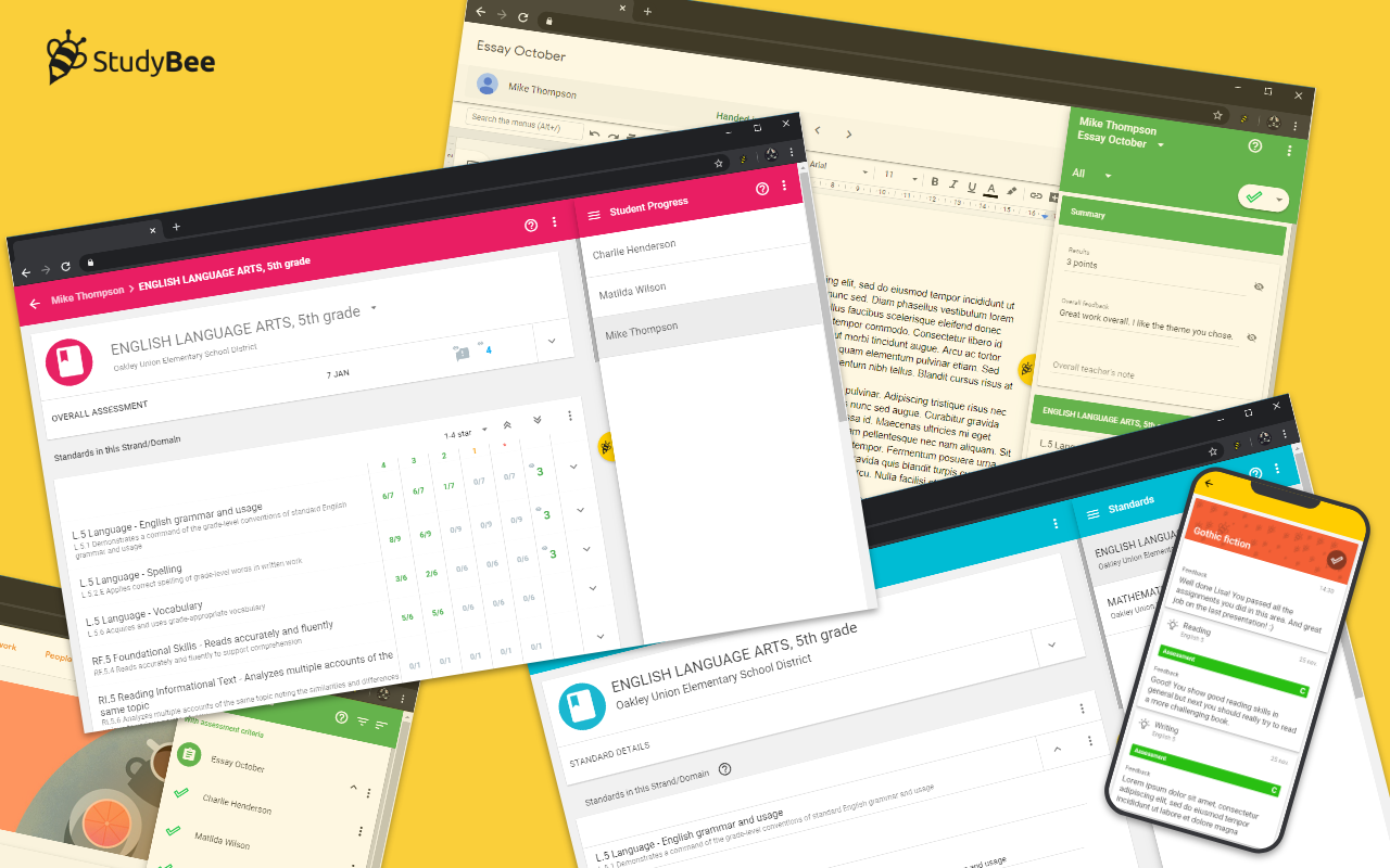
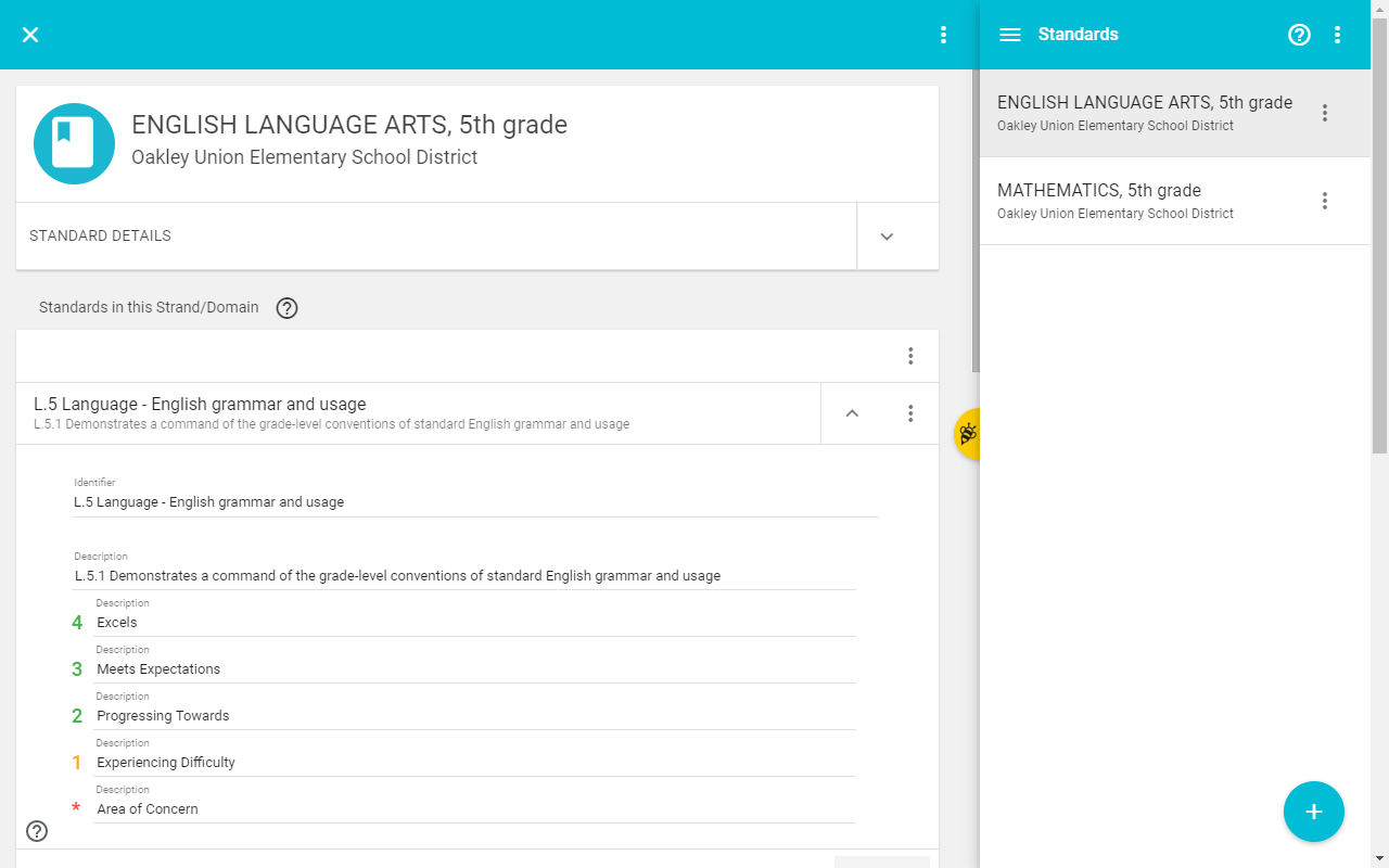
THE SERVICE
StudyBee is a grading and student feedback system that extends Google Classroom functionality, with the ability to link assignments to custom or standardized educational objectives. StudyBee provides an efficient grading workflow for teachers while providing a powerful feedback tool for students. With StudyBee you can:
• Grade assignments and give feedback
• Track student progress
• Connect national standards to Google Classroom
• Save and share curriculum with other teachers
• Share grading with other teachers
• Export data
• Students can get a good overview about their progress.
• Grade assignments and give feedback
• Track student progress
• Connect national standards to Google Classroom
• Save and share curriculum with other teachers
• Share grading with other teachers
• Export data
• Students can get a good overview about their progress.
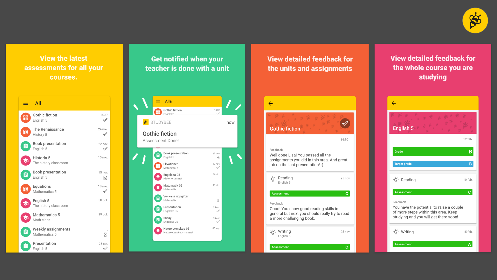
The mobile version aimed for students
THE FRAMEWORK – HOW WE GOT THERE
As mentioned earlier, the nature of this kind of small start-up will be the biggest challenge throughout the project. Besides that, there are a couple of key things that we had to take in consideration early on.
GOOGLE CLASSROOM + STUDYBEE
One of the early challenges was to investigate how we could make a seamless and integrated experience between Google Classroom and StudyBee. It mainly boiled down to two things to consider:
LEVEL OF DEPENDENCY
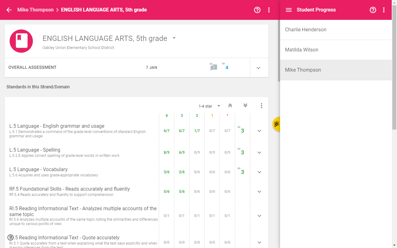
The question here involves if Google Classroom and StudyBee will be one single unity or more independent of each other. If we would go for a single unity it would be more master (Google Classroom) slave (StudyBee) relationship where every interaction takes place in Classroom and StudyBee just follows. After some exploration it landed on something in between. We identified some critical use cases where StudyBee really needed to listen to Google Classroom and that involved for instance when a teacher navigates to a student’s turned in document.
In other use cases we also found that the teacher wanted to navigate to a student within StudyBee independently of Google Classroom.
In other use cases we also found that the teacher wanted to navigate to a student within StudyBee independently of Google Classroom.
LEVEL OF INTRUSIVENESS
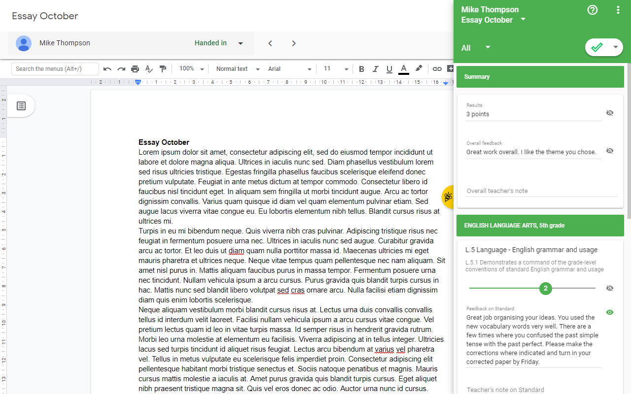
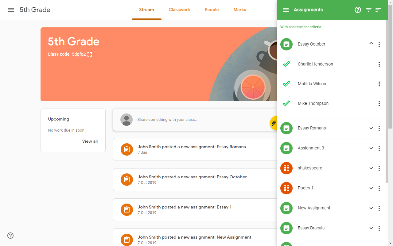
For the teacher, Google Classroom is their main tool. But we wanted to encourage the teachers to use StudyBee so we did some nudging without being too intrusive. There is especially one situation where we want to get attention and that is when the teacher creates an assignment in Google Classroom. So, when this happened, a toast showed up in the top corner asking if the teacher would like to assign learning objectives to the assignment. If the teacher clicked the assign button, then StudyBee would appear from the side and open the assign objectives view for that assignment.
THE GREAT VARIETY BETWEEN TEACHERS WORKFLOW
Although teachers have a common goal when it comes to grading there are a lot of differences between them when it comes to how they approach their goals. A teacher in math has a whole different approach compared to an English teacher for instance.
Within our team there were some tension surrounding this topic. Some wanted to make StudyBee flexible almost like a blank paper where the teacher had full control to customize everything. This approach sounds attractive in some way of course. Though we saw some major risks with this:
• Challenging to make it easy to use.
• More costly. It would take longer to get StudyBee to market because of more complex functionality.
Instead we went for the approach that we should aim for finding the common ground for most of the teachers and then take it from there. And later adapt our tool to be more customizable when we find out more about the users.
SCALABLE SCALES
Since the goal was to go international in the long run and we knew that teachers wanted different grading scales for different purposes, we had to keep this in mind from start. One aspect was the grading scales. We investigated grading scales in other countries and found out that scales varied a lot, from three steps up to 15. Therefore, we needed to find a scale component that could scale well at the same time visualize progress. It ended up that I suggested that we should go for a slider component because of the familiar design pattern and scalability.
CLICK COUNTING
“We hate tools with too much clicking” was one thing we often heard from users and schools. This is of course a fair opinion and I could not agree more. Even one school had a method where they counted the amounts of clicks to measure the quality of a product. However, the lack of detail and perspective from this kind of comments made me a bit frustrated. For me there are a whole lot of different factors that could be just as frustrating, such as cognitive load or amount of scrolling.
What I had to do is try to focus on the big picture and the user’s tasks. I tried to identify what the teachers meant, and it usually boiled down to the fact that the teachers did a lot of repetitive tasks since they most of the time have to grade all their students.
In our product this resulted in multi-selection functions that solved some of these pain points
• Batch editing
• Make assessments visible for all students
• Mark all assessments for all or specific students to DONE
Later in the lifecycle of StudyBee I did also some concrete improvements to reduce clicks. For instance, the possibility to expand all expandable lists at the same time.
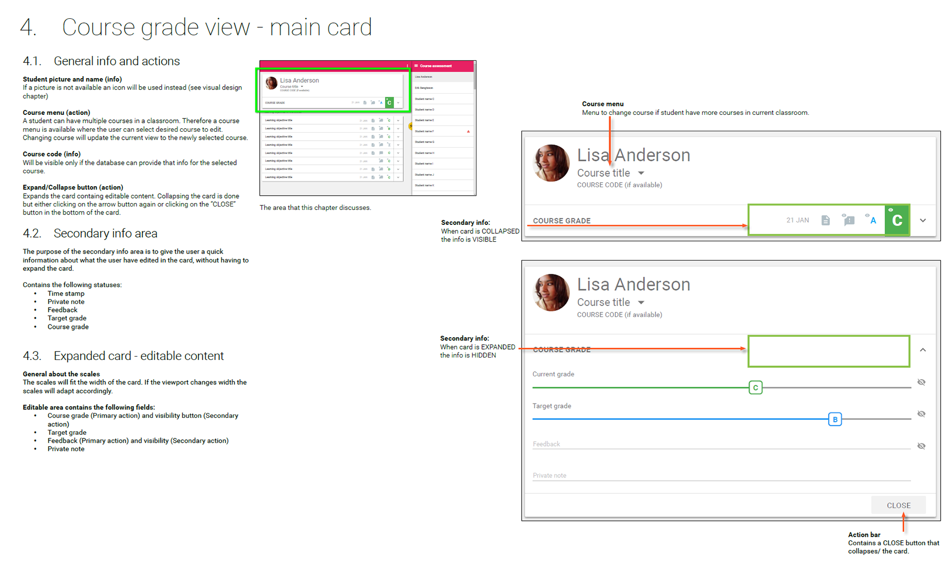
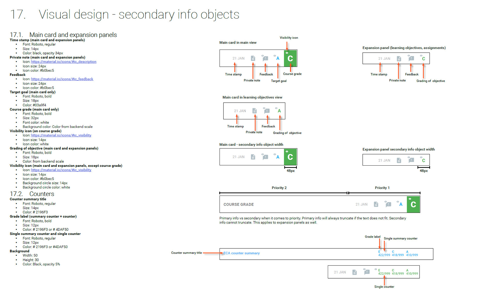
DETAILED DESIGN
The way I communicated the design changed along the way. For instance, design specifications in the beginning were more like wireframe documentation. Later, I moved away from that and made the specifications entirely as interactive presentations in Adobe XD, combining both written documentation when necessary and prototypes. This made it all more efficient. Especially the possibility to make changes to the specifications on the fly without having to generate a new version of a document.
I also communicated design differently between the team in the office and the remote team. In the office I could communicate design with more rough sketches and have regular meetings. But with the development team in Poland I had to make sure that all the design specifications were as detailed as possible and with high quality. I also had regular meetings with the team in Poland to present new features that was planned in future sprints. Even though the specifications were not finished in these meetings I still made sure the quality was descent. The developers found this very helpful and inspirational since it would give them a clearer understanding of the direction. '
The level of detail in the design and the specifications was challenging to handle because of the time and resource limitations. I had to balance it, especially when it came to the visuals. I had to rely on the developers that they kept a decent eye on making things almost as intended. Certain things like fonts’ styles and sizes was very important. I was more forgiving on exact positioning of objects. Basically, I gave the developers guidelines about alignments of objects and the margins, but I did not expect it to be pixel perfect at this stage.
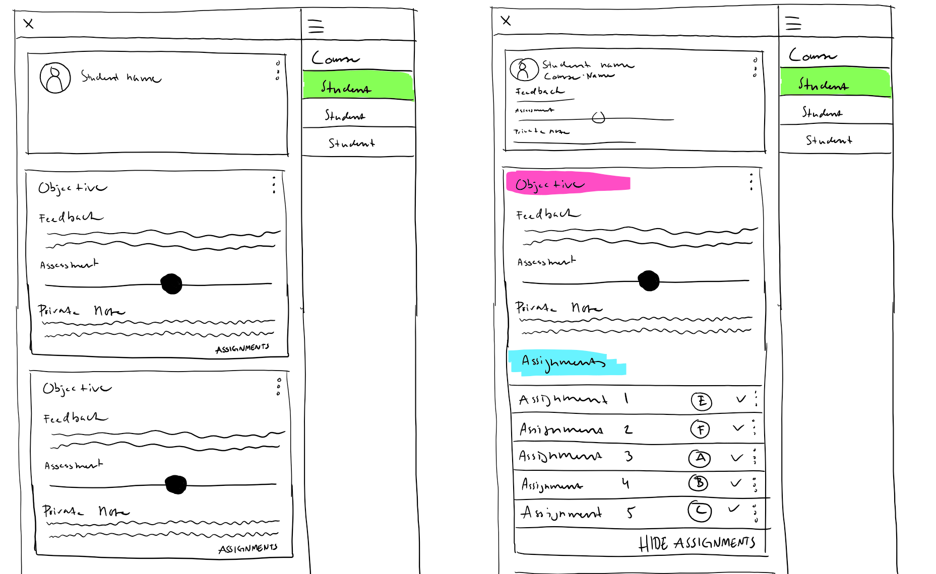
Rough sketches like these were sometimes used when i presented design ideas to team at the office.
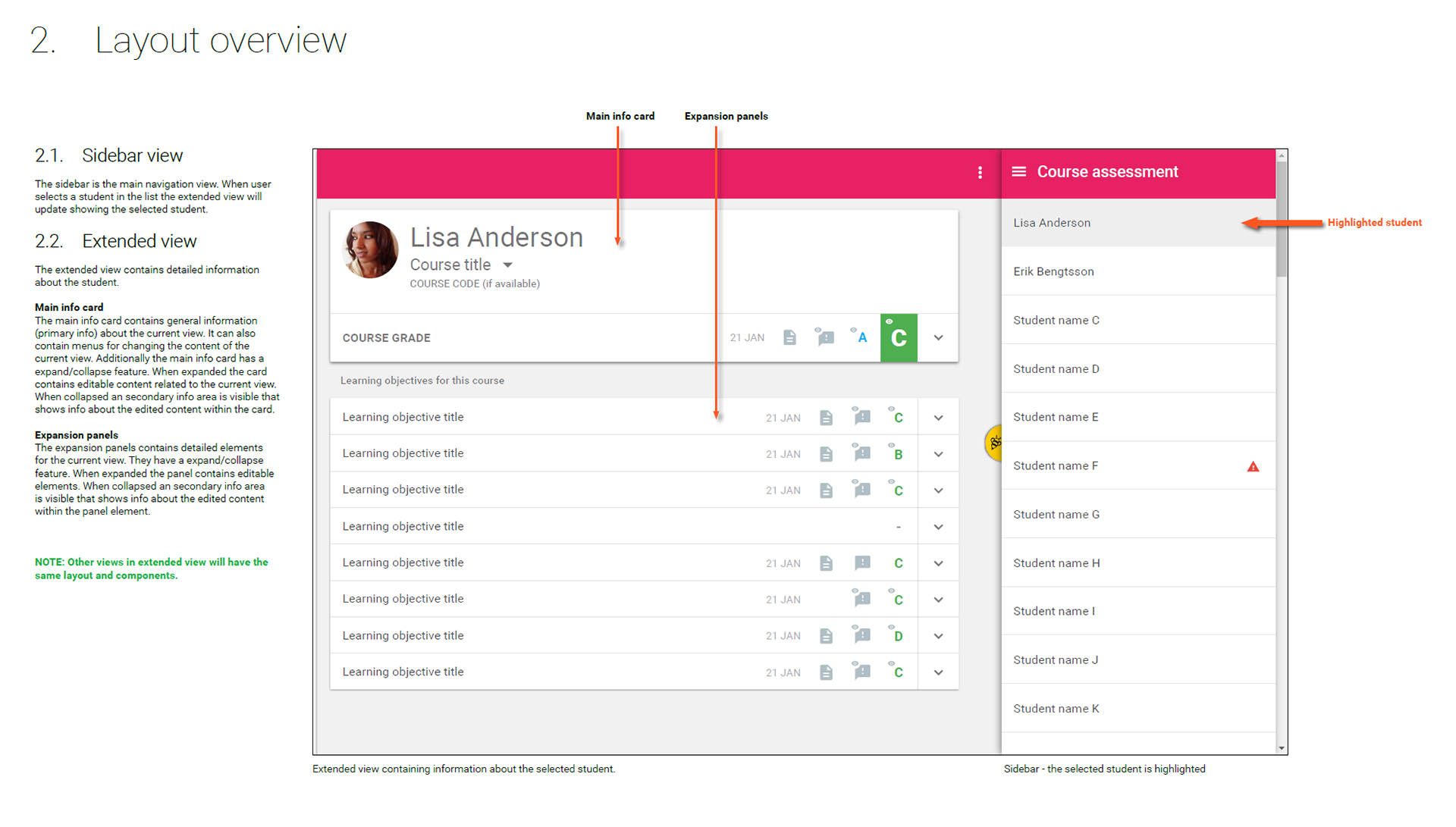
Detailed design specification aimed for the development team. Made in Indesign
Detailed design specification aimed for the development team. Made in Indesign
Detailed design specification aimed for the development team. Made in Indesign
A clip showing how my design specification looked like when they were made in Adobe XD
THE EXECUTION
Our overall process was based on Lean Startup methodology. We wanted to get our product out to market quickly so that we could understand the users better to make proper improvements.
The development started about six months into the project. In the best of worlds, it would be preferable to have spent more time on research and the design.
As mentioned, the development team was located on a remote site which of course was a challenge, but we constantly refined the process which in the end worked well. The process scrum based:
• We had daily stand-ups through video calls.
• We worked in two weeks sprints
• We had weekly backlog refinement
• I had regular design walkthroughs with the developers
• After every sprint we had a walkthrough of what had been accomplished and a retrospective.
From the beginning we were all aware of having a remote consultant team was not optimal in the long run because of the risks it involves. For instance, the risk of losing a developer or the lack of flexibility during critical moments. But still, I think the strategy went well anyway because we got to market more quickly.
VALIDATION AND CONTINUED EVOLVEMENT
When the first version was about ready, we contacted some teachers and our pilot school. We conducted user testing and got some interesting feedback. Most of the feedback we got was related to:
• Terminology issues. For example, some teachers found terms in StudyBee that conflicted with the terms in Google Classroom.
• Some confusion about the on-boarding process.
• Some users did not really understand the relationship between grade an assignment and grading the overall progress for a student.
A more severe issue we would soon find was that StudyBee was not that stable as we hoped for. An unstable tool that is used for professional use and with sensitive data is one of the worst things that could happen and will quickly lose credibility. Obviously, it was still in beta stage.
FASTFORWARD
When StudyBee became more stable and we introduced more functionality we got more schools evaluating and buying StudyBee. This made it a lot easier to get proper feedback from our users. We wanted to take advantage of this by keeping the users close. If a user sent us some feedback, we often tried to get in contact with them personally by booking a video call. In this way we got a lot of valuable feedback. Not only the specific things about StudyBee but also other things surrounding their needs etc. All feedback from the users we made sure to document it properly so that it would give us a clearer picture on what we should prioritize.
Reflections
As a whole I am proud what we have achieved so far. We have more customers than ever, and we are about to establish outside of Sweden as well. From a designer perspective, I am a bit more ambivalent. On one hand the customers are happy with our product, especially when it comes to ease of use compared to other competitors. On the other hand, I can clearly see a lot of things that could improve. For instance:
1. Navigation hierarchy needs to be more flattened. Certain features was difficult to foresee which resulted in that we had to add more navigation levels than we wanted. Instead the idea is to have a complete flat navigation and use overlays instead which is helpful in terms of not loosing context.
2. Differentiate between the act of viewing and the act of editing data. The problem of combining these activities is that it tends to result in that editable fields takes up more real estate than needed which results in a poorer overview. Furthermore, functionality that is focusing purely on viewing and analysing data is needed.
3. Improve/remove loading times. This is currently an issue when it comes to navigating up and down in the hierarchy. Also, teachers assess a lot of students and when they change to another student there should be no loading times. In retrospect we should have focused on this more earlier.
4. The on-boarding process. We need to be better at nudging the user in the right direction. A detail like the default grading scale should be what the majority of the teachers use for the particular country.
5. Finally, feature wise we underestimated the importance of guardians. Before GDPR this would have been a simple feature.
The decision of getting to market quickly has been crucial for our product. All the feedback received from the customers from real life use cases has been far more valuable than any user research with sketches and prototypes. Still, a lot of research in the beginning helped us get the product into a viable state that attracted enough interest from the schools.